What Your Pop-Up Shop Layout Says About Your Brand Name
Before your team says hello, before anyone picks up a product or asks a question, your space is already talking to your customer.
The way you lay out a pop-up shop communicates things your visitors may never consciously register, but always respond to. The distance between displays. Whether the entrance feels open or cluttered. Where the eye lands first. These are not decoration decisions. They are brand decisions.
And they take place even before you speak.
First Impressions Are Built in Seconds
Your customers make up their minds fast. When they walk into a space that feels thoughtfully arranged, they relax. When they walk into one that feels chaotic or cramped, they move through quickly, or they leave.
That reaction is not about taste. It is about trust. When your layout feels considered, it signals that your brand has put real thought into the experience. That signals quality, reliability, and intention.
A rushed or improvised pop-up shop design says something too. Even if your product is excellent, the space tells the story first. Make sure it's the correct one.
The Entrance Sets the Tone for Everything
The first few feet of your pop-up shop are the most valuable real estate in the whole space. This is where your customer's attention either hooks or disappears.
A strong entrance display does one thing clearly. It tells the customer what your space is about in a single visual. One hero product. One clean story. Not everything your brand has ever made.
If you try to show too much at the entry point, you create visual noise. Customers get confused, slow down, and often step back out. A focused entrance pulls people in, and once they are in, the rest of your layout carries them through.
Flow Is a Design Tool You Need to Use
How a customer moves through your space is not accidental in a well-designed pop-up shop. It is planned, and you should be planning it deliberately.
The general principle is that customers naturally move to the right when they enter a retail space. If you account for this, you can place your key products or experiences along that natural path. You create a journey rather than a grid.
Dead-end corners, awkward turns, and products stacked in ways that require effort to see all interrupt that journey. When the flow breaks, so does the engagement. Good pop-up shop design thinks about your customer's body moving through space, not just their eyes scanning a display.
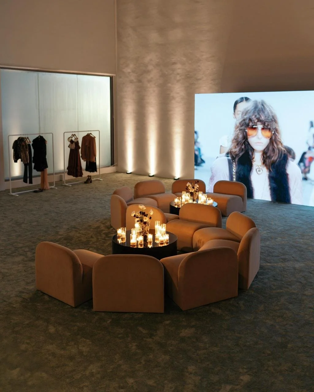
Density Signals Your Price Point and Brand Positioning
This is one of the most overlooked aspects of pop-up retail design, and it communicates your brand positioning more loudly than almost anything else.
If you are positioning as a luxury or premium brand, you need to give your products room to breathe. Wide aisles, considered spacing, and sparse displays say "each item is worth your full attention." If you crowd every surface, you are sending a contradictory message, and your customers will feel it even when they cannot name it.
If you are a high-volume or value brand, denser arrangements can work well. More product, more options, more energy. But that only works when it matches what you are actually selling and who you are selling it to.
This is exactly where working with The Design Pop Up Agency makes a real difference. When you rent a pop-up shop space and need it to perform from day one, the team handles everything from space planning and furniture selection to final styling, making sure your physical space reinforces your brand story rather than working against it. That alignment between identity and layout is what separates pop-up shops that feel considered from ones that simply look busy.
Where You Place Your Team Matters More Than You Think
You might not think of your team as part of your layout, but they are. And their positioning can make or break the experience your customer has.
A team member stationed near the entrance can feel like a barrier. Your customers will often avoid walking past someone who looks like they are about to pitch them something. Positioning your team within the space, active and engaged with the product or display, rather than standing guard at the door, creates a completely different dynamic. Customers come to them rather than the other way around.
Think about where your people will stand before the day begins, not after you notice something is not working.
Experiential Pop-Up Shop Design Thinks Beyond the Shelf
The best pop-up layouts give your customers something to do, not just something to look at.
A touch point, a product to test, a display they can interact with, a moment that is designed to be photographed and shared. These elements are not extras you add if you have a budget left over. They are strategic. When your customers engage physically with your space, their dwell time increases, and so does the likelihood of a purchase or a recommendation.
Experiential retail layout is about designing moments, not just arranging merchandise. Ask yourself: what do you want your customer to feel, touch, or do inside your space?
Your Layout Is Your Brand
Every choice in your pop-up shop layout reflects something about who you are. The height of your display units. The amount of negative space you allow. The placement of your checkout area. The way you guide customers from one product to the next.
None of it is neutral. None of it is invisible.
The brands that understand this build spaces that feel like an extension of who they are, not just a container for what they sell. That is the difference between a pop-up shop people walk through and one they remember, recommend, and come back to.
Frequently Asked Questions
How much space does a pop-up shop layout actually need to work effectively?
There is no minimum size that guarantees success. A well-planned pop-up shop design in a compact space consistently outperforms a poorly planned one in a large footprint. The key is editing ruthlessly. Fewer products, more deliberately placed, nearly always create a stronger impression than filling every available surface. When you rent a pop-up shop space, The Design Pop Up Agency works with the footprint you have and focuses on making it feel intentional rather than just occupied.
Can you change a pop-up shop layout mid-activation if it is not working?
Yes, and sometimes you should. If your customers are consistently bypassing a display, moving through the space too quickly, or clustering in one area and ignoring another, those are signals worth acting on. Small layout adjustments, such as moving a key product forward, opening a sightline, or repositioning a team member, can shift customer behaviour significantly. Planning for that flexibility in your original pop-up shop design makes adjustments easier to execute without disrupting the whole setup.
How do you translate brand identity into a physical pop-up shop layout?
It starts with understanding your brand's values, your customer, and the message your activation needs to communicate. From there, every layout decision, including spacing, display height, product density, and traffic flow, should serve that message. A calm, premium brand builds space differently from an energetic, product-rich one. The Design Pop Up Agency approaches every brief by asking what you need your customer to feel when they step inside, then builds backward from that answer through furniture, layout, and styling.